The Empire Strikes Back is, on the whole, the most revered Star Wars film… and for good reason. The movie had very talented people behind the camera: director Irvin Kershner, writer Lawrence Kasdan, and director of photography Peter Suschitzky. Obviously everyone has their own personal favorite Star Wars movie, but on the whole Empire has excellent directing, acting, pacing, dialogue, and character arcs. However, there’s also one area where Empire excels, especially compared to its other films, that many tend not to notice.
It also has the best shot composition ever seen in Star Wars.
While it may not seem as important as good special effects, characters or dialogue, in films with such detailed world building good shot composition is key to selling the emotion and world of the film. Don’t believe us? If you remember Luke’s lightsaber duel with Darth Vader at the end of The Empire Strikes Back, you probably don’t remember it looking like this:
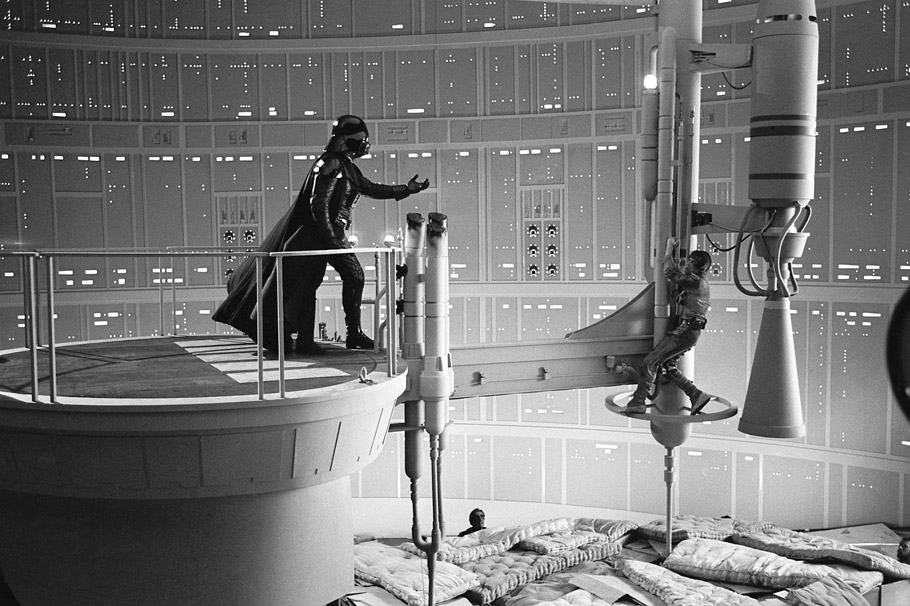
You’ll notice the set is actually quite small, with the walls surrounding the catwalk only really ten feet away at most. However, due to excellent shot composition that set looks like this on screen:

Notice how those same claustrophobic walls now appear to be hundreds of feet away, giving the impression of a vast chasm surrounding Luke and Vader. How’d they accomplish that without CGI? A simple trick involving an out of focus background.
Take the following two frames, which in turn convey a sense of depth and the emotion of the moment:

In the first frame, Vader is in the foreground — large and imposing as he strikes at a helpless Luke, who is in the middle of the shot. Both of them act as separate layers that provide a sense of scale, not to mention attention, which takes our eyes off the background as it is fuzzy and out of focus… thus seeming much more distant.

Now check out the next frame. Luke is the one moving into the foreground, now in the position of power having just scored a hit on Vader. In one subtle side step, the territory we just associated with Vader being in control shifts to Luke for just a moment. It’s very possible you didn’t even recognize it, but it’s there and it’s very deliberate. Everything is conveyed in one subtle shot, while still managing to seem bigger than it really is.
While you do see tricks like that in the other Star Wars films, Empire uses them with the greatest skill. You’ll notice in many of the best traditional shots, the foreground and background are typically there to give the audience a certain sense of scale, where the actual subject of the shot is caught between the two. Thus, depth is born. And boy, does Empire have depth in spades.
Now, it may be unfair to compare Empire to A New Hope, which had far less of a budget. But what about Return of the Jedi? It has the same writer and cast, but it is directed by Richard Marquand and shot by Alan Hume. Jedi is massive and even more epic in its ambitions than Empire. Surely it must look better and bigger, right? Well, let’s take a look.
Empire vs. Jedi: The Lightsaber Duel
Keep in mind the two frames from Empire‘s lightsaber duel above. Here, we’re witnessing a similar moment from Jedi‘s duel. The first shot is a classic over the shoulder shot of Luke attacking Vader.

In the next, a reverse close up of Luke attacking.

Certainly not terrible, but it’s also lazy compared to Empire‘s subtle use of focus. It’s the classic shot/reverse shot editing you’d see in a dialogue conversation. Not convinced? Let’s check out another.
Empire vs. Jedi: Dagobah

Here’s a shot of Dagobah as Luke arrives on the planet in Empire. The shot is filled with fog, which makes the set feel large because it obscures the horizon. The fog also helps scatter the light to give the swamp a soft and eerie feel that makes us feel uneasy. Lastly, the shot has depth not only because of the X-Wing’s nose pointing away from us, but because of three points of orange color arranged at various distances from the camera: the X-wing’s light in the foreground, R2’s light in the middle, and Luke’s flight suit in back.

Meanwhile, this establishing shot from Return of the Jedi feels somewhat flat in comparison. While there is fog, it mostly settles around the ground and does little to enhance the lighting, which is all coming from a source on the upper left of the screen… almost like someone is shining a big light from ceiling (which they are). All the color, meanwhile, is relegated to the same plane of the image: the X-wing. Behind the ship is simply a wall of vines, abruptly cutting off the image in the back and making the scene feel claustrophobic. This is essentially the same set as the shot from Empire, yet is feels restrictive.
Close Ups:

In Jedi, when Luke is talking to the spirit of Obi-Wan Kenobi, he suffers from the same flat lighting as the rest of Dagobah in the film.

But look at Luke’s close up on Dagobah in Empire: engulfed in dark shadows that not only suggest the pull of the dark side (he’s about to enter the cave, after all), but also give an uneasy feeling as Luke is nervously fixated on something we can’t see.
If you want the same shot from Jedi that tries to illustrate that same pull of the dark side, you may remember this:

It has all the same pieces as the shot above: Luke’s face is half in shadow, he’s looking off screen, and he’s clearly nervous about something. However, the image’s shadows are simple and harsh… lacking the subtlety of the shot above. Instead of making us feel uneasy, this shot is screaming at us to feel that way.
If you’re curious what this shot looks like in other moments of the saga, check out this shot from Revenge of the Sith:
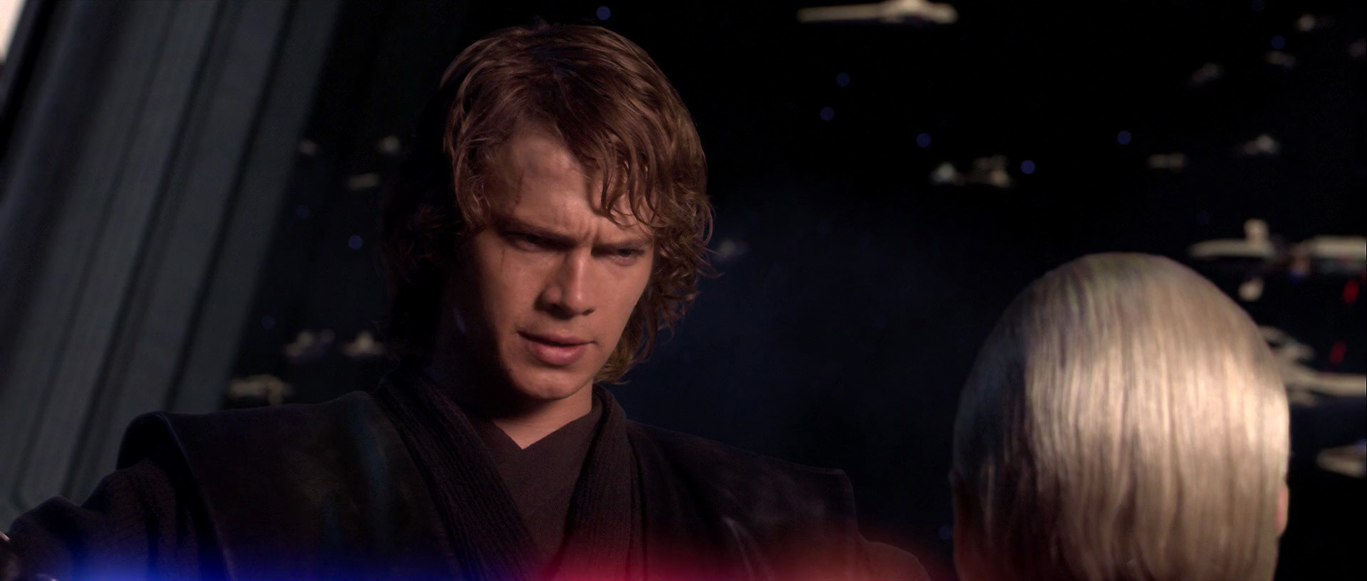
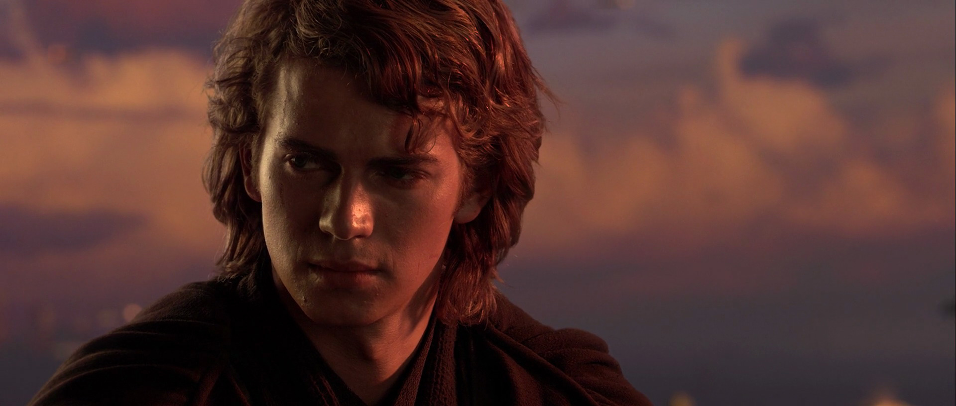
Instead of shadow and lighting set ups, Lucas is trying to use the two lightsaber blades in Anakin’s hands to signify his inner turmoil… not to mention Hayden Christiansen’s acting. Unfortunately, it’s framed in a very bland, flat, close up, and he’s really shot no different than anyone else is the rest of the film. The following shot is far more evocative, a rare use of close up in the Prequels that also uses the light and shadow to enhance Anakin’s contemplative gaze. The use of sunset reminds us that, not unlike the daylight… Anakin’s time in this chapter of his life is almost up:
Examples of depth (and attempted depth) in the other Star Wars films:
The Phantom Menace:

This is actually a pretty good shot, as the hallway is clearly drawing our eye toward Obi-Wan’s goal: Qui-Gon and Darth Maul. Obi-Wan fits nicely in the foreground and his destination in the background. However, it’s missing something important that gives a shot not just good depth, but great depth: a third point of interest. With only Obi-Wan and his destination as the two objects that catch our eye, the image feels just a touch more flat than it could have been.
Attack of the Clones:

Lucas loves his grand, sweeping special effects shots, but a lot of the time they can feel rather flat… such as here. We have a legion of Clonetroopers as well as massive ships taking off to fight wars on other planets… and for some reason we’re not quite feeling a sense of grandeur. Again, it’s only because we really have two points of interest: the troopers and the ships. Which one is the focus of the scene? We have two points of contrasting color, but they’re both in the background and thus don’t really give much depth to the image. So, in the end, it lacks a three dimensional quality.
Revenge of the Sith:

This shot is designed to have depth to it. The lines on the floor point back, as do the lines of traffic in the distance. So, again, why does it feel flatter than it should? The CGI background may be to blame, but it’s the lack of points of interest in the shot. They want you to see the floor, Anakin and his men, and then the horizon, but neither the floor nor the horizon convey any information about the scene. There’s only one point of interest: Anakin and his men, which are on the same part of the picture. What should feel like an imposing force feels smaller than it should.
Strangely enough, one of the best shots of the film is most likely an accident:

It’s just a cutaway, but it works incredibly well. Unlike the shot above, it clearly wasn’t designed as a shot of massive depth, and yet it has infinitely more. Obi-Wan stands with unsure footing, defensive in the foreground. Between them, Anakin’s threatening lightsaber divides them as the center of attention. In the background, Anakin presses as a determined force of doom. The piping to the right also serves to extend our eye line going from left to right that begins with the two men. A very powerful, uneasy image that perfectly exhibits all the emotion that the duel wanted to convey.
A New Hope:

Here we go. A perfect shot with fantastic depth. There’s a reason why this moment has become classic: we have Luke’s homestead in the foreground (where he came from), Luke as the subject in the middle (where he is), and the horizon in the background (where he wants to go). All three take us on a journey from the left side of frame to the right, and all are relevant to the character and his present state of mind. They come together to not only give the image three dimensional depth, but also deep emotional depth. Throw in the perfect lighting of dusk and you have an instant classic.
Return of the Jedi:

As far as positioning goes, this shot is actually very good. You have the Emperor on the foreground, a looming presence elevated over the rest of the scene and reaching for Luke (again, our subject) in the middle as he almost defensively stands in front of Vader, defeated in the background. The shot is very clever as with each level of depth we descend in power, going from the most powerful being in the galaxy to a dying man on the floor. The only real flaw here, as with most of Jedi, is the incredibly flat lighting that does nothing to accent or enhance the image. Instead, what could have been brilliant is merely very good.
How does The Force Awakens fair compared to its predecessors so far? Take a look at part two to find out.
But before we go we’re going to try one last exercise. Below are iconic shots (or close to them) from the lightsaber duels of each movie. Look at all six closely based on the criteria you’ve seen (or already knew) from above, and come to your own conclusions on which is the best shot.


All the screen caps in this article were provided by the blogs Star Wars Screencaps and Shadow of Reflection.


2 Comments